

R-13 Risk Bulletin – April 2021
Monthly Risk-Bulleting: April 2021
Date: May 10, 2021
Last revised: May 13, 2021
Objective
The objective of the Monthly Risk-Bulletin is to provide an overview a) of lessons learned during the past month in the project, b) of a score-card-type system to communicate the state of risk of supply chains impacted by COVID-19 supporting health infrastructure and the workforce between the U.S. and Mexico, and c) of a communication system to facilitate the restoration of broken supply chains and the formation of new ones to reactivate trade between U.S. and Mexico. The report aims to offer valuable insights to the general public and decision-makers towards informed preventive actions to reduce the current pandemic’s potential impact on critical supply chains and better strategize about feasible social, economic, and environmental risk-mitigating actions against COVID19 and converging threats. This bulletin is jointly produced by the project’s PIs, the project’s contractors, and the U.S. binational task force serving as advisors to the project.
| Project PIs | |
|---|---|
| Zenon Medina-Cetina, PhD – PI | Gregory Pompelli, PhD – Co-PI |
| Matt Cochran, DVM, MIA – Co-PI | Maria Jose Perez-Patron, PhD – Co-PI |
| Miriam Olivares, GISP – Co-PI |
| Document prepared with the support of: | Reviewed & Approved by: |
| Enrique Z. Losoya, Guillermo Duran, Juan Pablo Alvarado, Barnett Jimmy | Dr. Medina-Cetina – PI |
| PhD Students SGL – Research Assistants | Date: 05/14/2021 |
Suggested citation:
Medina Cetina, Z., Pompelli, Gregory., Cochran, Matt., Olivares, Miriam., Perez-Patron, Maria J., Duran, Guillermo., Alvarado, Juan Pablo., Z-Losoya, Enrique., & Lopez-Acosta, Araceli. (2021). CBTS-SGL Monthly Risk Bulletin: April. https://r13-cbts-sgl.engr.tamu.edu/
@misc{Medina2021,
   author = {Medina Cetina, Z. and Pompelli, Gregory and Cochran, Matt and Olivates, Miriam, Perez-Patron, Maria J. and Duran, Guillermo and Alvarado, Juan Pablo and Alexi, Allen, and Torres, Cesar, and Barnett, Jimmy, and Lopez-Acosta, Araceli, and Sanchez-Siordia, Oscar, and Rojas, Minerva and Zarate-Losoya, Enrique},
   title = {*CBTS-SGL Monthly Risk Bulletin: April.*},
   url={https://r13-cbts-sgl.engr.tamu.edu/},
   year={2021},
   month={April}
}
Table of Contents
- R-13 Risk Bulletin – April 2021
- Objective
- I. Project Status & Lessons Learned
- Milestone 3: Data-Lake
- Milestone 4: Risk-Bulletin
- Update on the status of the US Covid-19 and Mexico Covid-19 dashboards
- II. Risk Communication Mechanism
- US Corn Exports to Mexico 2013 – 2020
- Risk Matrix Update
- Mexico Social Vulnerability Index Data Update
- CDC’s Social Vulnerability Index
- Recomputation of the SVI Methodology and Validation Process
- Actionable Information – Research Briefs – 2 – U.S.and Mexico COVID-19 Dashboards
- Actionable Information – Research Briefs – 3 – Analysis on U.S. States COVID-19 Dashboards
- III. Restoration and Creation of Supply Chains
- References
I. Project Status & Lessons Learned
Contributing Milestone 2: Taskforce
- The eighth Taskforce meeting is scheduled for 03.26.21
- There are four additions to the U.S.-Mexico COVID-19 Taskforce:
- Thomas Wilkinson, MD, Chief Medical Information Officer, Office of the Chief Medical Officer (OCMO), CWMD-DHS
- Dr. Julia Marinessen, Health Attaché, U.S. Department of Health and Human Services (HHS), U.S. Embassy in Mexico City
- Dr. Julie Loisel, Associate Professor, Department of Geography, Texas A&M University
- Dr. Dennis Gorman, Interim Department Head, Department of Epidemiology and Biostatistics, Texas A&M University
Milestone 3: Data-Lake
- Definition of preliminary objectives and hypotheses following the scientific method was completed for the Research Problem 2: Personal Protective Equipment research problem & Research Problem 3: Auto Manufacturing Sector.
Milestone 4: Risk-Bulletin
Update on the status of the US Covid-19 and Mexico Covid-19 dashboards
US Covid-19 Dashboard
- Other States dashboards were identified to locate datasets and inspiration for our platform.
- The team concluded The team concluded that the platforms used the most are ESRI ArcGIS or Tableau. . As shown in Table tbl. 1
Table 1: These platforms are the most used. Platform Totals ESRI (ArcGIS) 21.5 Public Tableau 16.5 Microsoft PowerBI 8 Looker 1 DataViz 1 Google APIs 1 Plotly 1 - The number of variables utilized by each model was queried, and a graph was made for comparison. This can help inform the appropriate number of variables to be utilized in the Risk Platform:
- Confirmed Cases
- Fatalities
- Testing Rates
- Vaccination Rates
- Health Systems Services
- The number of variables utilized by each model was queried, and a graph was made for comparison. This can help inform the appropriate number of variables to be utilized in the Risk Platform.
- This can help inform the appropriate number of variables to be utilized in the Risk Platform.
- After identifying the variables they must be classified into the type of evidence they present.
- The three main types:
- Observations
- Model Predictions
- Experts Beliefs
- The three main types:
- The next step is to classify the variables observed into the Risk assessment model, with the 5 main types of risk that will be utilized.
- The number of variables being used in the models were analyzed with the numbers of cases and deaths.
- It appears as if the number of variables had an inversely correlated relationship with the numbers of both cases and deaths.
- It could be that the more robust the analysis and modelling, the better the measures that can be recommended to mitigate spread.
- Next, homogenization of the variables will need to be done to fit into a singular model.
- Each state uses different indexes and variables, they must be preprocessed to work together in a national model
- Other national models can be consulted to examine whether this has been done and whether there are datasets already available.
Mexico Covid-19 Dashboard
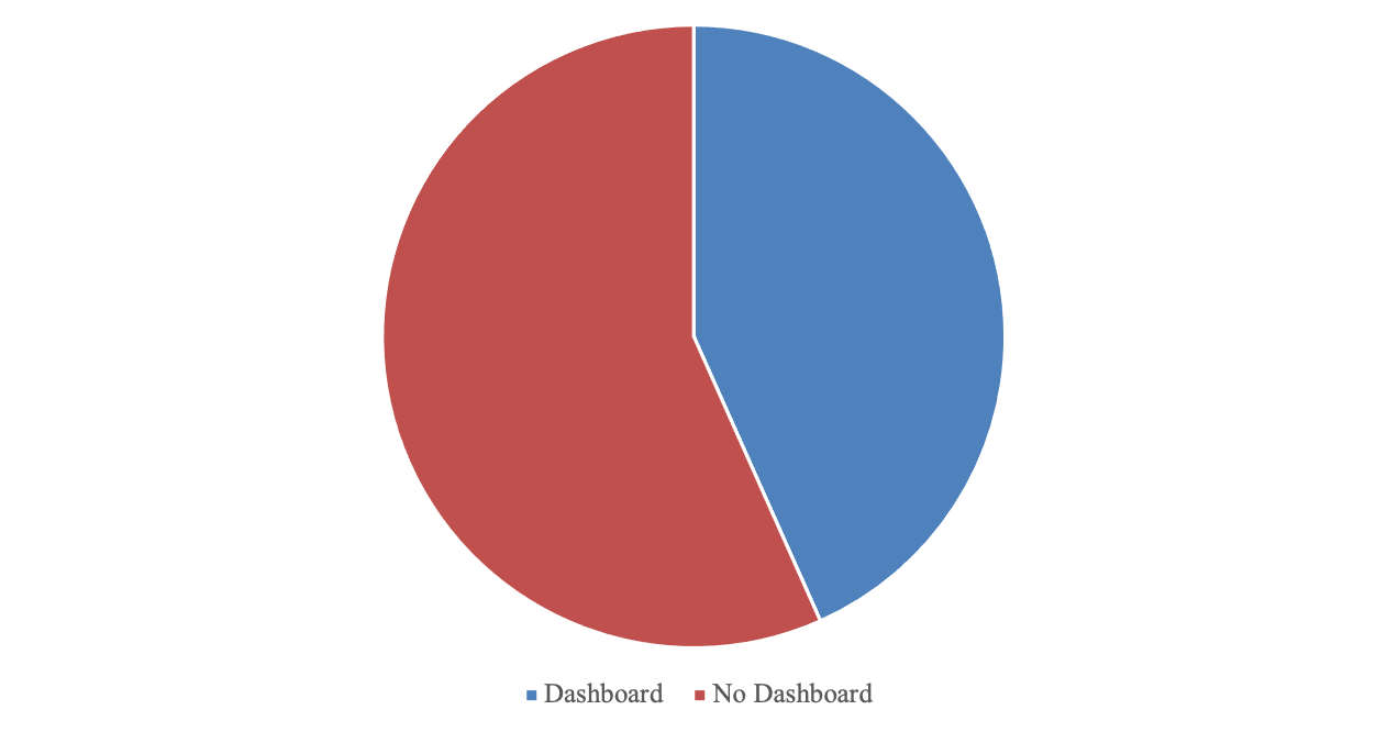
- State dashboards for Mexico were also collected.
- 17 States had no dashboard
- 13 States had some form of Covid-19 dashboard
- 2 States (Yucatan, Zacatecas) data was not able to be located
II. Risk Communication Mechanism
-
Purdue Food and Agriculture Vulnerability Index
- The Department of Agricultural Economics at Purdue University and Microsoft developed an online dashboard to quantify risk to potential supplies of Agricultural Products from COVID19 (COVID Data Tracker, 2020b)
- Including:
- beans, cattle, vegetables, hogs, chickens, wheat. rice
- How this project quantifies ‘risk’ should be examined to better understand how it should be quantified in our own models as well as compare the compatibility of the two approaches.
- Including:
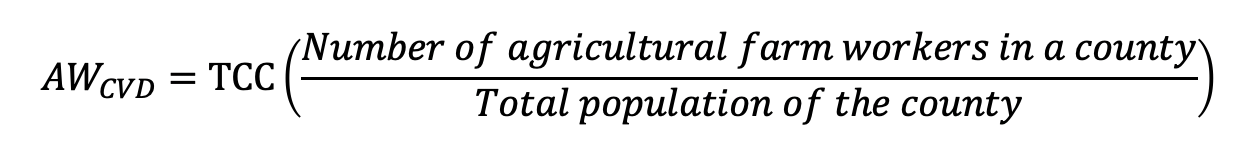
- Risk Variables:
- Total number of COVID19 cases by county
- Expected number of Agricultural workers with COVID19 (AW_CVD)
- Assumes number of Ag workers with COVID19 is at the same rate as total population of county
- County level data on the number of farmers and hired laborers from 2017 Census of Agriculture
- County level data on population from 2019 Census Bureau (US Census Bureau Population by County, 2019)
The equation to estimate risk is detailed below in Fig. 7
- The Department of Agricultural Economics at Purdue University and Microsoft developed an online dashboard to quantify risk to potential supplies of Agricultural Products from COVID19 (COVID Data Tracker, 2020b)
- Economic impact from COVID19 illnesses
- Labor productivity for a commodity at a county level is calculated with:
- Data also obtained from the 2017 Census of Agriculture
- Formula utilized to determine productivity detailed in Fig. 8
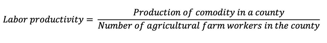
- Economic Risk or “lost productivity”
- Conclusions:
- The expected number of agricultural workers with COVID-19 (AW_CVD) can be complemented by other indicators such as the effective reproduction number (Rt).
- The estimated lost productivity considers evidence of COVID-19 Threat and its Impact.
- Evidence about the health of the workforce system such as demographics, comorbidities, and health system services capacity can complement this estimate.


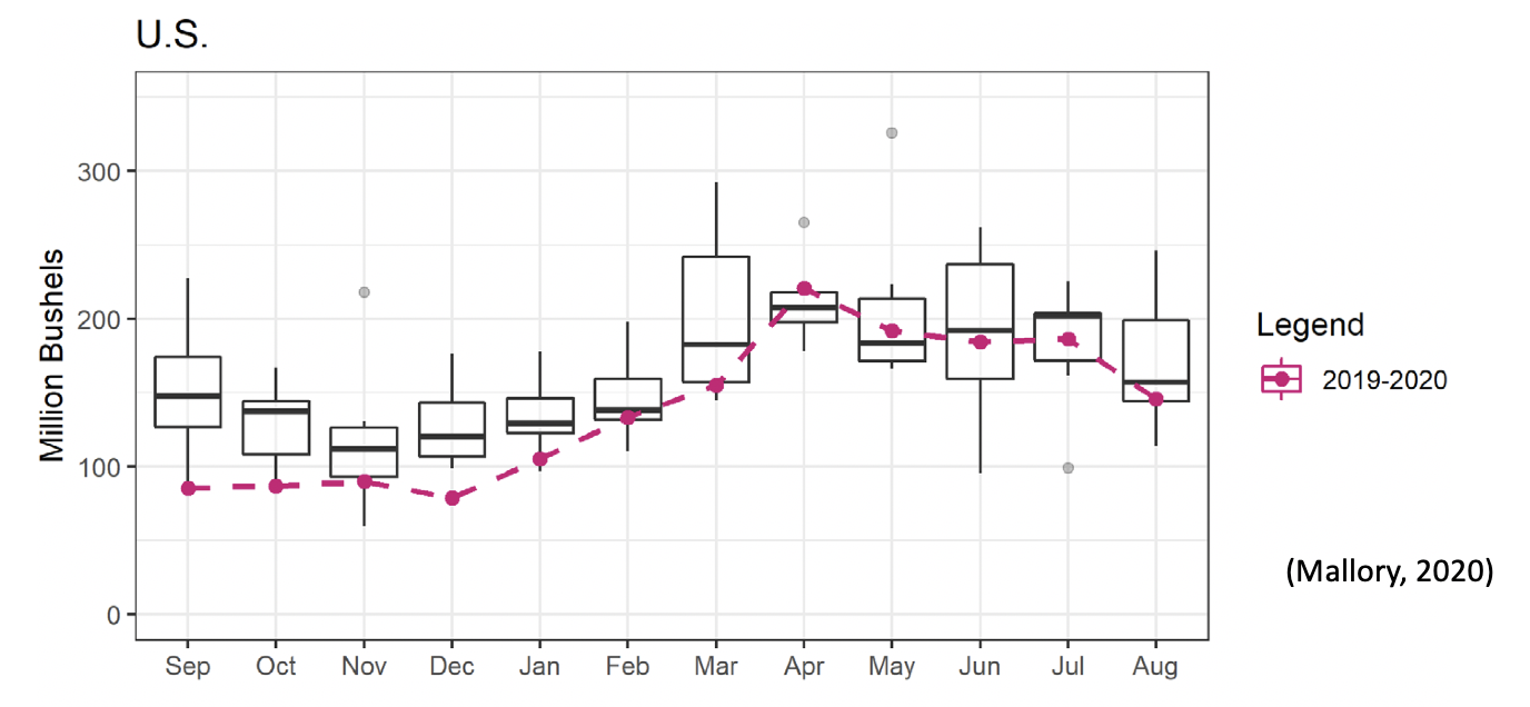
US Corn Exports to Mexico 2013 – 2020
- Corn is harvested once per year, US corn for 2019 – 2020 was harvested before the pandemic hit.
- There were no pandemic related disruptions to supply.
- In the Mallory 2020 study, corn exports from 2013 – 2018 was contrasted with 2019 – 2020 data to examine potential disruptions.
- The corn export levels over time can be seen in Fig. 11
- Can this data be applied to US – Mexico Corn trade
- The historical data can help examine this questions shown in fig. 11.
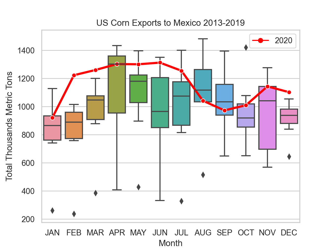
- Other data sources corroborates the findings from this data
- USDA World Agricultural Production Report (2020)
- United States Agricultural Export Yearbook (2020)
- According to the (Mallory, 2021) study and results from 2013-2020 data: “Grain, oilseed, and poultry export shipments have been relatively unaffected, but beef and pork export shipments experienced significant reductions”
- “Meat supply chains are especially vulnerable, and disruptions to processing capacity harms farmers, processors, consumers, and trading partners” (Mallory, 2021).
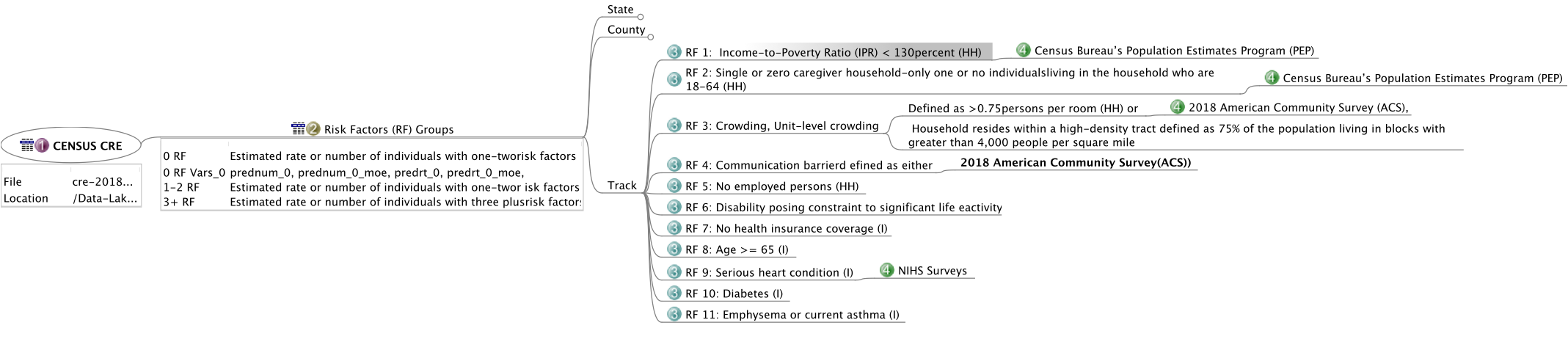
Risk Matrix Update
- Variables are being identified from the Community Resilience Estimates (CRE) (Community Resilience Estimates, 2020) index for use in the Risk Framework
- 12 variables have been identified so far, each with their own sub-variables and equations
- These variables are visualized in Fig. 13
- Progress on the Risk Matrix:
- Updated risk matrix with SVI/CRE/MCVI/MSVI Variables
- Categorized estimated variables under risk framework
- 104 Variables identified for ingestion and categorized
Mexico Social Vulnerability Index Data Update
- 64 total variables in file (Mexico Social Vulnerability Index, 2020)
- Variables are vizualized in Fig. 14:
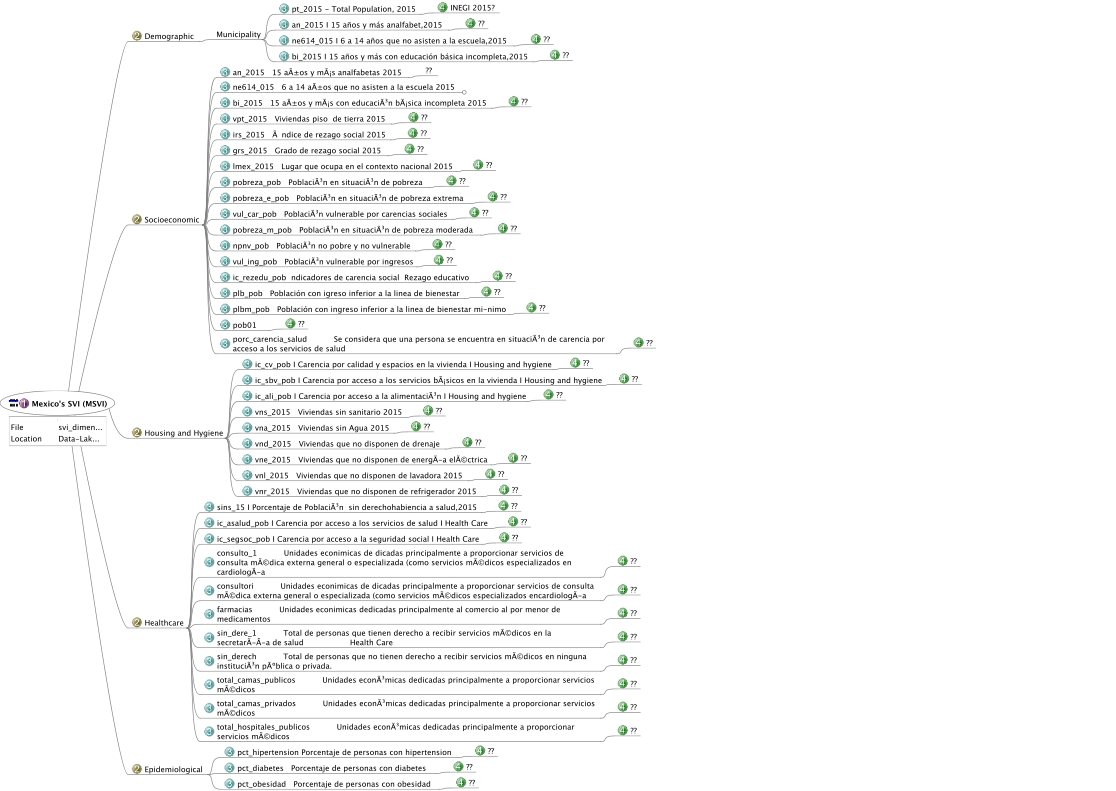
- Data was separated into 5 themes:
- Demographics (2)
- Socioeconomic (18)
- Housing and Hygiene (9)
- Healthcare (11)
- Epidemiological (3)
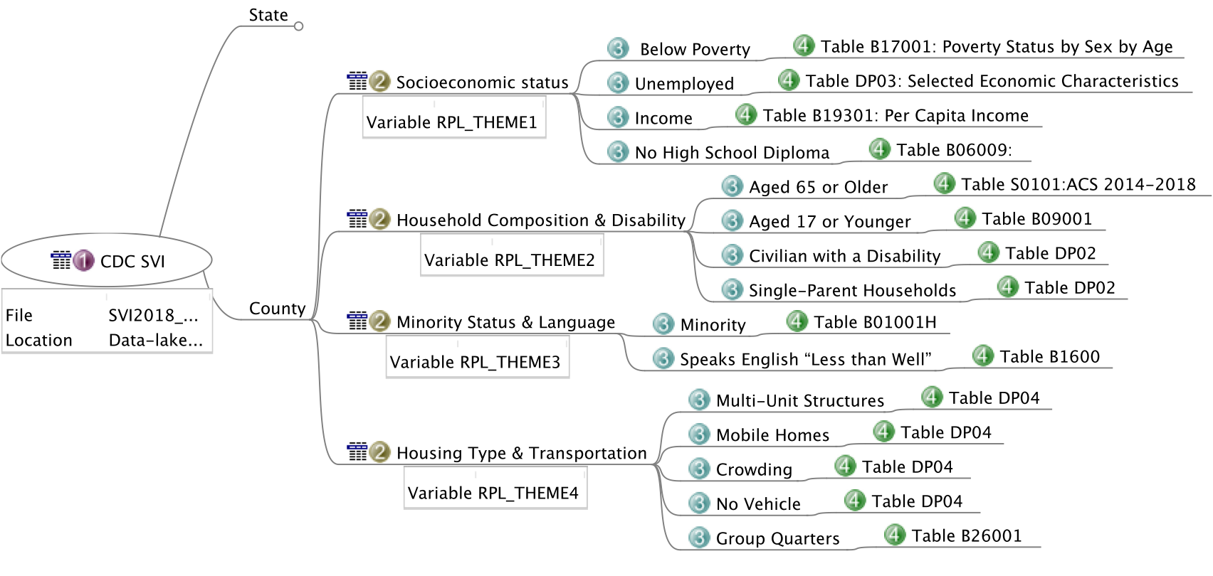
CDC’s Social Vulnerability Index
- So far, there are 125 Columns of data per County (Flanagan et al., 2018a, 2018b)
- Including corresponding margins of errors, ratios, percentages, indexes
- 17 Estimates
Calculations for how to best find the Union of the MSVI and US SVI are underway.
- Preprocessing and analysis of the indices and variables which make up the data are necessary.
- The two datasets were compared for commonality as well as to prepare to process for one product dataset in Fig. 15:
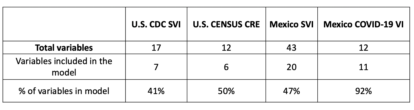
- Breakdown of variables from CDC’s SVI in Fig. 16:
Recomputation of the SVI Methodology and Validation Process
We have replicated the methodology employed by the CDC to calculate and validate their results. This exercise aims to use this computation script to incorporate new sources of information and variables to compute an index for a potential supply chain. The following interacive graphics describe the validation process and results (Fig. 17)
Once a good match was archieved, it was decided to classify and incorporate variables into themes that follow our groups’ risk framework. The following interactive story (fig. 18) shows and describes the status of this effort. The modified index was computed for all counties in the United States.
Actionable Information – Research Briefs – 2 – U.S.and Mexico COVID-19 Dashboards
During the COVID-19 pandemic, national and international organizations have developed interactive dashboards and platforms to present information related to COVID-19 spread and data on the management of the pandemic. The information presented in the dashboard (or dashboards) falls inside recurrent themes such as confirmed cases, fatalities, statistics on testing and vaccination, and the availability of health services and infrastructure. Data is presented in the form of time-series plots, pie charts, or even maps, according to the characteristics of the variables being communicated (COVID Data Tracker, 2020a; Dong et al., 2020; Max Roser & Hasell, 2020).
The objective of this research brief is twofold, first to present a consolidated list of URLs for the location of state dashboards in the U.S. and Mexico, and second to assess the amount of information presented through the count of the number of variables included in the dashboards. Dashboards and platforms included in this analysis correspond to those developed by official entities of each state, both in the U.S. and Mexico. As such, national dashboards, or platforms developed by Universities or companies are not included in this research brief.
US Dashboards
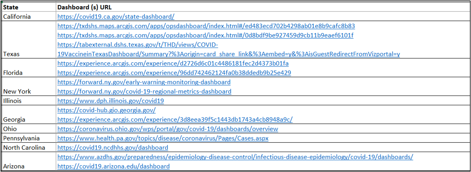
The Fig. 19 shows the number of different variables that are included in the dashboards for each state. Also, by clicking a particular state, a popup window will appear with the links to the different dashboards. Table 2 includes all the URLS for the 50 states.
Figure 19: Number of variables presented in U.S. State Dashboards.
Mexico Dashboards
The Fig. 20 shows the number of different variables that are included in the different dashboards for each state. Also, by clicking a particular state, a popup window will appear with the links to the different dashboards. Table tbl. 3 includes all the URLS for the 50 states.
Figure 20: Number of variables presented in Mexico State Dashboards.
For the case of Mexico, the fact that some of the states don’t have an official state dashboard doesn’t mean that information about the COVID-19 pandemic, and its management, is not being communicated. The lack of information in the previous figure is indicating that, for a particular state, the information is not being presented through an interactive dashboard, but it could be communicated through daily or weekly reports. The analysis of non-interactive reports is beyond the scope of this research brief.
Actionable Information – Research Briefs – 3 – Analysis on U.S. States COVID-19 Dashboards
This Research Brief #3, and #2 on COVID-19 Dashboards, is focused on the analysis of the variables of U.S. dashboards from different perspectives and classifications. In order to do this, the sequence of activities of Fig. 19 was followed.

As such, the following sections describe the dashboards, and their variables in terms of:
- Development platform
- Distribution of number of variables
- Type of evidence
- Type of variable
- Risk components
An additional section in this Research Brief compares the amount of information presented in each dashboard with social States of Risk such as cases and deaths. The final section summarizes the results and includes the key takeaways and conclusions of the analysis.
Development Platform
Table 4 lists the different platforms used by the State entities to develop their dashboard(s). As it can be seen, a total of 29 out of 50 dashboards, were developed using either solutions by ESRI or Tableau. This is followed by a minority of dahsboards developed in Microsoft Power BI, and some other solutions such as Looker, DataViz, Google APIs, and Plotly.
| Platform | # of dahsboards |
|---|---|
| ESRI (ArcGIS) | 22 |
| Public Tableau | 17 |
| Microsoft Power BI | 8 |
| Looker | 1 |
| DataViz | 1 |
| Google APIs | 1 |
| Plotly | 1 |
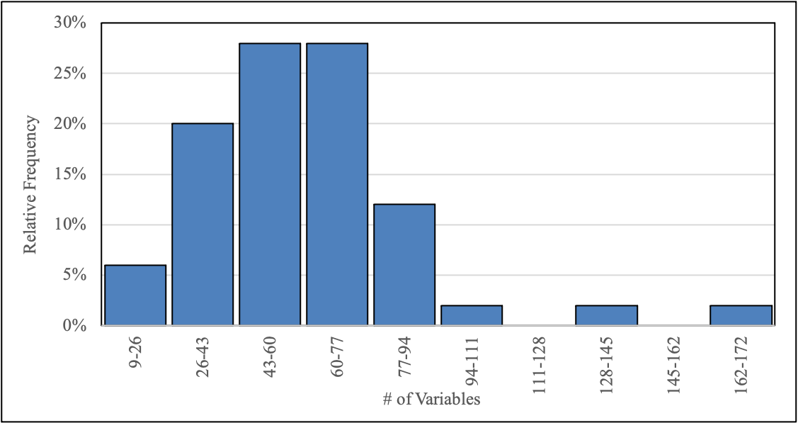
Number of variables
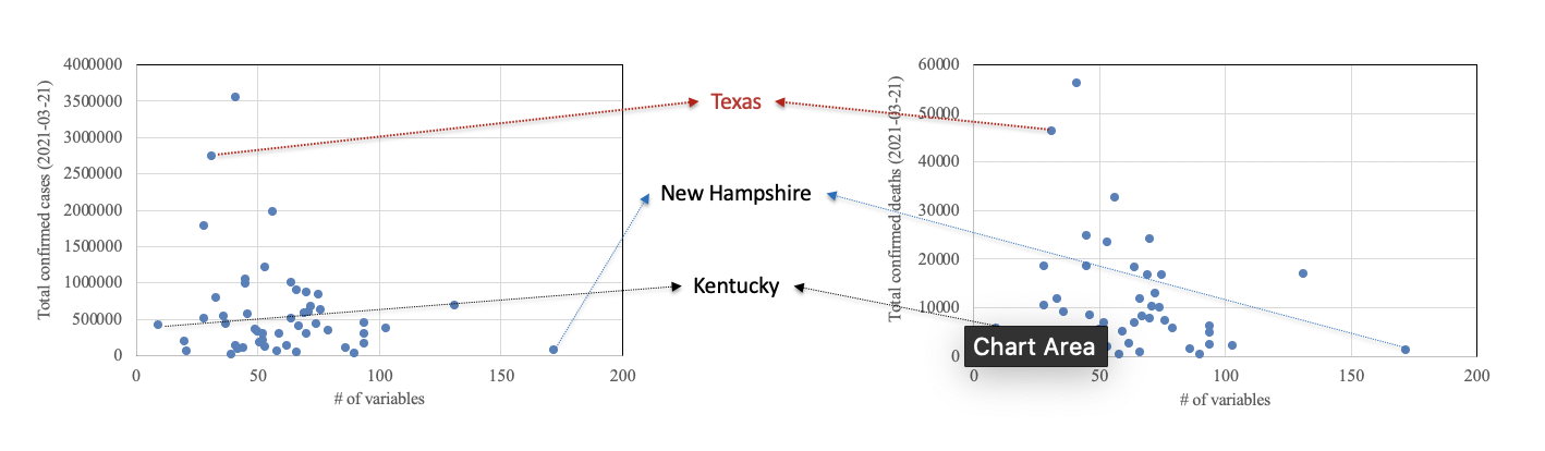
The Fig. 21 shows the total number of variables included in the U.S. State COVID-19 Dashboards. The color scale reflects the quartiles of the distribution. As such, 25% of dashboards present between 9 and 43 variables, 25% between 43 and 57 variables, 25% between 57 and 72, and a final 25% between 72 and 172.
By hovering over the States, a pop-up window will display the total number of variables, and a set of links to visit the dashboards.
Figure 21: Number of variables presented in U.S. State Dashboards.
To take a better look at the distribution of the number of variables, a relative frequency histogram is included in Fig. 22. Below, some descriptive statistics are shown:
- Minimum: 9. Corresponding to Kentucky
- First quartile: 44
- Second quartile/Median: 59
- Average: 61 variables
- Third quartile: 75
- Maximum: 127. Corresponding to New Hampshire
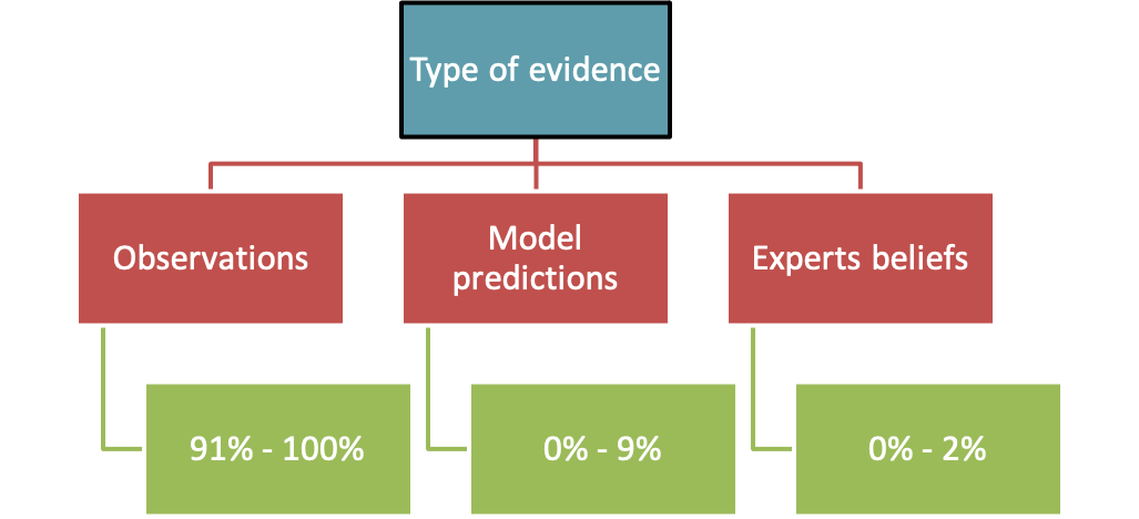
Type of evidence
The variables in the dashboard were further classified according to the type of evidence. In Bayesian inference evidence can come from observations, model predictions, expert beliefs, or a combination of them (Medina-Cetina et al., 2016).
After classifying the variables by type of evidence, it is possible to calculate the percentage for each one with respect to the total number of variables in each dashboard. These percentages are:
- Observations: 91% to 100%
- Model predictions: 0% to 9%
- Expert beliefs: 0% to 2%
Most of the variables come from observations from evidence on cases, deaths, and the capacity of health system services. A percentage less than 10% are model predictions, with variables such as the effective reproduction rate or models to predict deaths, and ICU bed occupancy. The only State that present expert beliefs is California, that includes expert opinions to adjust the value of daily COVID-19 tests.
Type of variable
The next classification of variables is by type. The different types are:
- V: regular variable, static in time and space
- V(t): variable changing in time
- V(x): variable changing in space
- V(x, t): variable changing in both space and time
Fig. 23 shows a boxplot for the 4 different types of variables. The distributions for the 4 types are similar, meaning that the variables in the dashboard are roughly equally divided in the 4 categories. Notably, given the nature of the pandemic and the development of the dashboards, there is a considerable number of variables that change in both time and space such as the time series of COVID-19 cases by each county in a state.
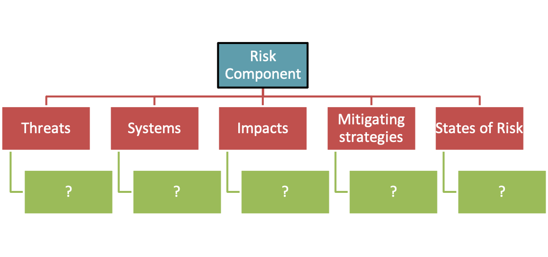
Classification by Risk Component
According to the Bayesian Risk definition, and framework from (Medina-Cetina & Nadim, 2008), Risk is defined as:
Risk = [Hazard] * [Vulnerability] * [Consequences]
Where:
- Hazard is the likelihood of occurrence of converging threats
- Vulnerability is the likelihood of reaching a Consequence or damage in the system of interest, conditioned on a given Threat Intensity
- Consequences represents the value of the elements exposed to converging threats
Variables required to estimate the Hazard, Vulnerability, and Consequences, have to depict the threats, the systems, and the impacts respectively.
The Risk Assessment framework is expanded into the following for representing Risk Assessment & Management:
Risk = [H*V*C] + [Cost(AC+PC)−AC−PC]
Where:
- AC= Active countermeasures
- PC = Passive countermeasures
In order to reduce the state of risk, mitigation strategies such as active countermeasures (AC), and passive countermeasures (PC) can be applied.
Considering Risk Assessment and Management, the 5 Risk Components are:
- Threat
- Systems
- Impacts
- Mitigation
- States of Risk
Fig. 24 shows a boxplot for the variables classified in the 5 Risk Components. The figure shows a higher number of variables for Systems and Mitigation across the 50 dashboards, with median values of 20 and 19 respectively. In contrast, Impacts and States of Risk have a median value of 7.
Examples of variables in each Risk Component are:
- Threats: Effective reproduction number, Daily COVID-19 cases
- Systems: COVID-19 cases age distribution, Available ICU beds
- Impacts: Fatalities gender/sex distribution, Fatalities race/ethnicity
- Mitigation: Total tests, Vaccine doses administered
- States of Risk: Daily fatalities, Total fatalities
Fig. 25 is a spatial representation of the number of variables on each Risk Component. By hovering over a state, a pop-up window will display the total number of variables for the corresponding Component.
Amount of information presented, compared to normalized COVID-19 cases and deaths
In order to assess the relationship between the amount of information presented in the dashboards with the management of the pandemic in the 50 states, Fig. 26, and Fig. 27 present a scatter plot of the total number of variables (and the number of variables for the 5 Risk Components) and the COVID-19 cases and deaths per 100k population.
The previous figures show no apparent relationship between the amount of information (number of variables) and the social States of Risk represented by the normalized COVID-19 cases and deaths. This is, there is no tendency for the cases and deaths to decrease with an increase on the number of variables from the dashboards.
Bayesian inference, and Bayesian decision-making, suggests that by having information about the components of the Risk equation, the decision making improves. This improvement allows for a better Risk Assessment and Management. This is not what the previous figures suggest.
To explore further the relationship, and the previous affirmation, Fig. 28 presents a similar scatter plot, but this time using the variables needed for Risk Assessment only (Threats, System, Impacts, States of Risk). The color coding on the scatter plots differentiates states that are below the median of the combined number of variables (Threats + Systems + Impacts + States of Risk), between the median and the third quartile, and above the third quartile. Once again, no evident correlation is found in the figures.
As a last exercise, states that include an aggregate index in their dashboards were identified. Table 5 includes the states, the name of the aggregated indexes, and the variables used to compute them. Finally, these states are marked with yellow in Fig. 29.
| State | Index | Variables considered |
|---|---|---|
| Alabama | COVID Risk Indicator | Declining new cases (2 weeks), Percent positive declining, Testing goals met, Visits for covid-like symptoms declining |
| California | County Risk Levels | New COVID cases per day per 100.000, Positivity rate (7 day rolling average), ICU availability |
| Colorado | COVID-19 dial | New cases (7 day incidence level), Percent positivity of COVID tests , Impact on hospitalizations (Stable or declining) |
| Connecticut | Leading and secondary indicators for schools | New covid 19 cases per 100.000 per day, Percent test positivity, New covid hospitalizations per 100.000 per day, Percent COVID-19 like illness hospital visits |
| Idaho | County Transmission Risk Levels | New daily cases 7 day rolling average per 100.000, Testing positivity rate, Regional hospital bed ocupancy |
| Illinois | COVID-19 Resurgence Criteria | Test Positivity 7-Day Rolling Average, Hospital Bed Availability 7-Day Rolling Average, COVID-19 Patients in the Hospital 7-Day Rolling Average |
| Indiana | Advisory level | 7-day positivity rate, Weekly cases per 100.000 residents |
| Louisiana | Community Risk Level | Cumulative 7 day incidence per 100.000, Cumulative 7 day percent positivity |
| North Dakota | County Risk Levels | Active cases per 100.000, Tests per 100.000, Test Positivity Rate |
| Ohio | Opportunity Index | Opportunity domains: Transportation, Education, Employment, Housing, Health, Access, Crime |
| Oregon | County Risk Levels | Confirmed and presumptive cases, Cases per 100.000 residents, Test Positivity rate |
| Virginia | Pandemic metrics – Composite score | Cases, Percent positivity, Outbreaks, HC workers, ED visits, ICU hospitalization, Hospital beds, PPE |
| Washington | Metrics for Risk Assessment | Rate per 100K newly diagnosed cases, Daily molecular testing rate, Percent of positive molecular tests, Percent of adult staffed adult care beds, Beds occupied by COVID patients, Percent of adult ICU staffed beds occupied, Percent of adult ICU staffed beds occupied by COVID-19 cases |
From the figures included in this section, it can be concluded that no evident correlation exists between the amount of information presented and social States of Risk. This holds true for the total number of variables in the dashboards, the number of variables required for a Risk Assessment, and also for those states that presents aggregated indexes, some of which are called Risk Indexes. Potential reasons for these findings are:
- Only social impacts and states of risk were considered in the analysis. No analysis including economic or environmental impacts was made
- Decisions based on the amount of information on the dashboards were intended to manage the economic impacts of the pandemic at state level
- Difficulties with risk communication. People are not assimilating the information, because they are not prepared or educated to do so
- The states have access to the information, and are communicating it through the dashboards, but their decision making could be influenced by external factors such as geopolitics
- The different levels of uncertainty on the information for different Risk Components, creates an added complexity on the decision-making processes
- This analysis doesn’t deal with, or considers, the acceptable levels of social risk that could be considered at state level
Conclusions
- This research brief on U.S. COVID-19 state dashboards presents a detailed description on the development platforms, and on the variables reported in terms of type of evidence, type of variables, and Risk Components.
- The amount of information presented in the dashboards was compared to social impacts such as normalized COVID-19 cases, and deaths
- No evident correlation was found between the amount of information and the social States of Risk
- Some reasons for this include the fact that only social impacts were considered, and also the particularities of decision-making at state level
- The findings of the research brief emphasize the importance of risk communication during a pandemic event
- There is a considerable room for research in order to understand why the correlations are not apparent, given that the theory suggests that decision-making improves when evidence on every Risk Component becomes available
III. Restoration and Creation of Supply Chains
The following efforts and manufacturers have been identified.
| Name | Industry | Category | Focus | Site | Price | Country |
|---|---|---|---|---|---|---|
| National Network for Manufacturing Innovation (NNMI) | Manufacturing – All | Online Databases Suppliers | Manufacturing | https://www.manufacturing.gov/ | Limited outdated content | US |
| Cadena de Proveedores de la Industria en Mexico | All | Catalog of Suppliers/Buyers | https://www.capim.com.mx/ | Registration Required | Mexico | |
| INOVAMX | Technologies | Industry Association | Technology | https://inovamx.mx/ | Registration Required | Mexico |
| Healthy Workplace | Healthcare | Catalog of Suppliers/Buyers | COVID19 – PPE | https://www.healthymx.com.mx/index.html | Registration Required | Mexico |
| Industria Nacional de Autopartes, A.C. | Auto | Industry Association | Auto Manufacturing | https://ina.com.mx/ | Limited free content | Mexico |
| 3M Mexico | Healthcare | Online Databases Suppliers | PPE | https://www.3m.com.mx/3M/es_MX/mercado-hospitalar-la/coronavirus/ | Limited free content | Mexico |
| AHRMM | Healthcare | Supply Chain | PPE, Ventilators | https://www.ahrmm.org/ | Registration Required | US |
| Thomasnet | Manufacturing – All | Online Databases Suppliers | Manufacturing | https://www.thomasnet.com/ | Limited free content | US |
| GlobalSpec | Industrial | Online Databases Suppliers | Manufacturing | https://www.globalspec.com/ | Limited free content | US |
| GetUSPPE | Healthcare | Online Databases Suppliers | PPE | https://getusppe.org/ | Yes, Crowdsourced | US |
| ProjectN95 | Healthcare | Online Databases Suppliers | PPE | https://www.projectn95.org/ | Yes, Crowdsourced | US |
| Operation Masks | Healthcare | Online Databases Suppliers | COVID Supplies | https://www.operationmasks.org/ | Yes, Crowdsourced | US |
| Oregon Health Care Association (OHCA) | Healthcare | Suppliers List – Blog | COVID Supplies | https://www.ohca.com/members/coronavirus/personal-protective-equipment-ppe/ | No, Static List | US |
| GovShop | All | Online Databases Suppliers | Government Suppliers | https://govshop.com/ | No, Registration Required | US |
| PPE Demand Model by AHRMM | Healthcare | Forecast Model | PPE | https://dashboards.c19hcc.org/ppe/ | Yes | US |
References